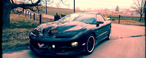
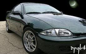
Ideas have been running through my head to the point where its driving me crazy. I made a photoshop a while back (pic #1), and have been running with that idea for a while now. The idea is to tone down and simplify the exterior, return the interior to stock, and work on the cars performance. Anyway, I recently got a new idea that i really like but the problem is now I have these two looks that i like equally.
Picture #1 ( K-max body kit, Gravana turbo hood, brickyard spoiler, one piece projectors)

Picture #2 ( Customized Z24 bumper with technic lip, Kmax sides and rear, Gravana turbo hood, brickyard spoiler, one piece projectors)

I like pic 1 because its a new kit that not many people have, and its not very wild. I like pic 2 because im using a new kit but also using a stock bumper and it looks agressive.
Now please excuse the crudeness of the shopped bumpers. The pics I used to begin with were very poor to work with so i did the best i could do.
What do you guys think? 1 or 2?

i vote #2
i chose #2 because i hate the kmax front bumper. it just looks goofy. Number 2 has a stock z front, which looks good no matter what, and the technic lip, which very few people have. i think the z front with the technic lip is more aggressive and looks 100 times better than that ugly kmax front.
edit button FTW
Edited 1 time(s). Last edited Tuesday, June 20, 2006 5:45 PM

[quote=Shädowire (mahcmos)]I vote #1
i already see where this is going, its going to still end up 50/50
Give me your reasons behind your choices

1
seems to flow better with the sides.


(Old School Vet)
"I was gone for a minute, but now I'm back..."
the way the car is already

1HOTCAVFIRE wrote:the way the car is already
not an option, in fact, the vertical door hinges are already gone

the front on pic 1 looks cleaner and simpler than 2. I vote for pic 1

First of all....keep the interior. It kicks ass. Secondly, I would go with number 2 but only if you leave the licsense plate hole and cut that whole peice out. It looks goofy with the holes on both sides and nothing in the middle. I love your car

i would say 2
but not based on your PS (don't mean to knock ur skills, but that PS does not even come close to what I think it would look like in RL)
that and the kmax front is too bubbly for my liking
Edited 1 time(s). Last edited Tuesday, June 20, 2006 6:58 PM

Exactly, that shop does suck because the pic i used was black, and its hard as hell to convert black into any color in photoshop and make it look good.

#1 IMO

Under Construction, should be finished before years over...
Corey
#1 I think number one looks better and the whole car's style all flows together.

#1 with fog lights in those holes.

For Sale.
#2 i like the stock bumper and the lip will make it look agressive, it flows with the hood well too

neither...but would choose #1 over #2. i hate the technic lip....it looks soo out of place and doesnt flow at all.
i'm baaaaack!!
im with you meckster i like them both equally also. How ever since you say your working on performance next I say go with number 2
#2 sans the gay (IMO) spoiler
i vote 2. i think it looks better as an overall flow, but i think the prostock would be a better spoiler than the brickyard. your car though and that wasn't really what was being asked, just thought i'd throw in my 2 cents in case you wanted to know. i like the more aggressive front in #2 and i also think it would look better if you're doing performance. the other reason i don't like #1 is that i feel it's too round. i know our cars are pretty round, but with the widebody you have it gives the body harder lines and i think that the second option would flow better with those.


For the record it wont have the widebody either, I forgot to mention that......... The only exterior mods that will be done are whats listed above. The vertical doors are already gone also like i said.


 (Old School Vet)