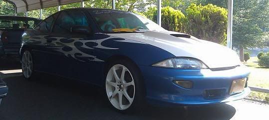
Nice---I have the same color and my corners cleared as well...not a fan of the graphics-but nice drop..Keep it up..

-ozzie

Yeah, i dont like the graphics either.
~2014 New Z under the knife, same heart different body~
______________________
WHITECAVY no more
2012 numbers - 4SPD AUTOMATIC!!
328 HP
306 TQ
if i'm not mistaken that looks like it's an ls sport
2006 Cobalt SS 2.4L 9.6 @74mph 1/8th mile w/2.28 60ft

its z24.....so the canadian version of the LS sport, it has the bottom lip
looks good

<IMG SRC="http://www.rankmyride.com/data//9/d/13326//.small/ashsig.jpg"></A
* TEAM GMCI RACING"*
* MY CARDOMAIN PAGE *
Would look soooo much better with those graphics in the trash.
those graphics are so 1998.

<Img src="http://www.icefire.ca/stylez24/stylez05sig.jpg">
Official member - www.ontarioCAVS.com & J-Body Club of Ontario
i say if you like the graphics.....keep them, but go with some subtle ones.personally
ClassGlass / RkSport / Eibach / Motegi / Ractive / Borla / K&N

i did them to make it stand out a bit fromn the other 10 ones identical in town....guess it didnt fly


