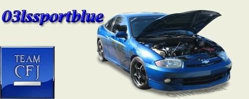
the front is too plain compared to the sides and rear

i know itm looks that way......but unfortunatly the fron thats made with the kit, looks little too wild ...once everythings all one colour i think it'll look better
not bad...definitely diggin the sides and rear, front is a bit dark to see much detail in it...but nice job! don't see enough sweet 2nd gens on here
<img src="http://registry.gmenthusiast.com/images/mishkafan/personal_pic.jpg">
I like that kit on that body style

^^^^ agreed looks sweet man
RIP JESSE GERARD.....Youll always be in my thoughts and prayers...


looks good but to me the sides dont line up with the front
<a href="http://www.cobaltss.net/forums//index.php?referrerid=37" target="new"><img src="http://registry.gmenthusiast.com/images/tgmtzmx/SatchmoeSigJBO.jpg"border="0"></a>

yeah.....unforunatly it doesnt quite line up..i may look into adding a bit of a lip or something later, but the grass makes the sides look a little more lower then they are....
it does however kind of line up in the middle where the skirts go up slightlybefore coming back down....so thats kinda why i did it.


