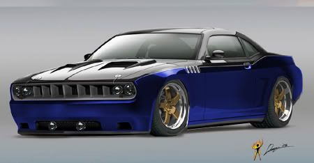
Ok guys c+c welcome but, I am just starting to do this and so these are early and some i forgot to save. So this is what I have....some of you might like em some will most likely hate em.lol...
If someone can suggest how to get the paint more realistic please tell me i've tried a bunch of things...Help is greatly appreciated.......Using photoshop 6
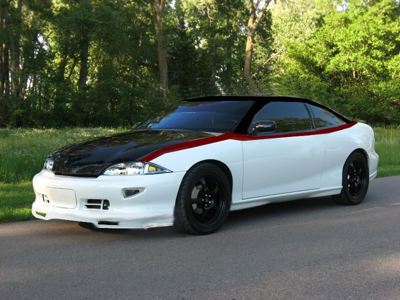
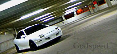
ZYAAAA's white z24
I chopped the roof and made a lip like he has and painted it white(not my favorite color to work with) shaved the handles and two-toned it but messed up the pin stripe

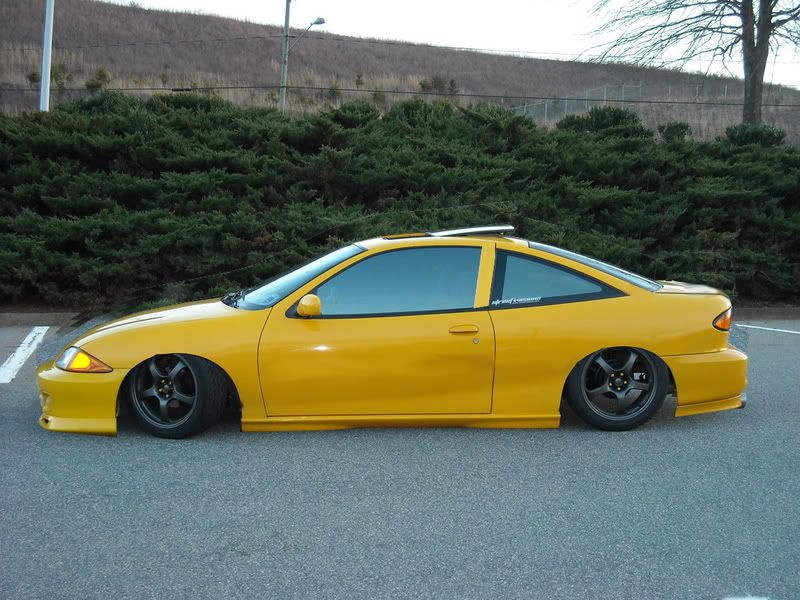
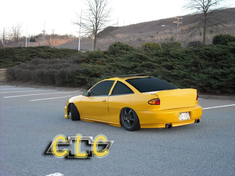
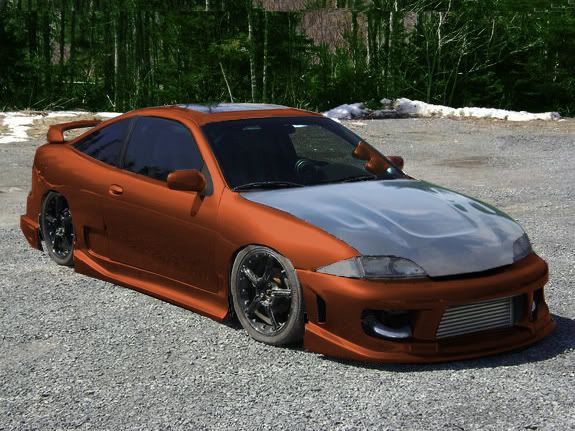
CLC's yellow cav
List of things done are in the :bag it please post:


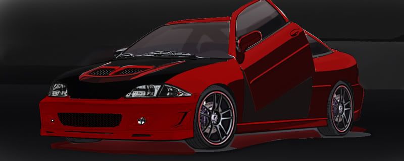
Qwibby's Cartoon render he did(i didn't cartoon this car not taking credit for that)
paint, bumper scoop,Lambo and underglow( i don't like it but i couldn't get it off after i did it)

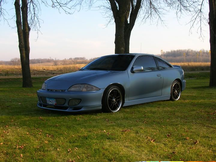
Not sure whose Cav but I found it on the .org
Painted car mirrors and handle darkened headlights and tint

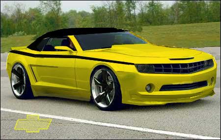
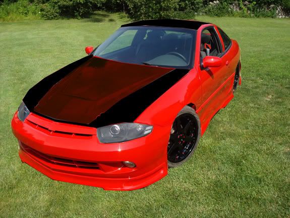
New Camaro
Lip kit, cowl induction hood, spoiler, two toned and pin striped shaved, side scoops, drop and painted rims, shaved emblems

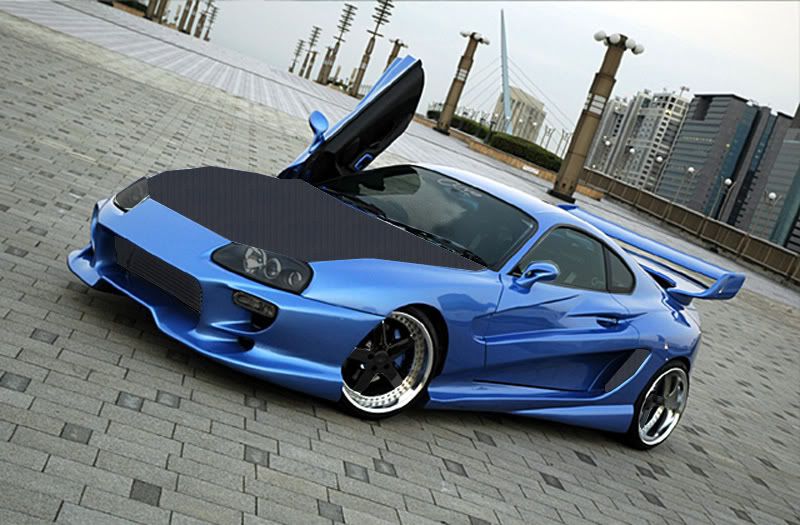
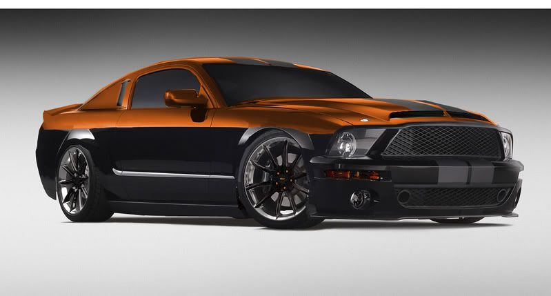
Supra
Painted rims and cheap looking carbon fiber( if someone can help please)

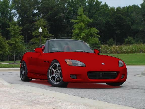
S2000
Paint and underglow and drop

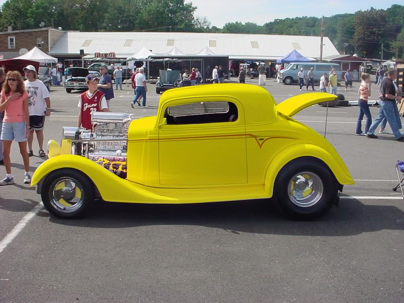
32 Chevy Ms. Pinky ( dads bosses car)
but /i painted it yellow

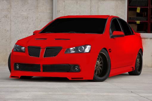
Pontiac G8
No front plate, lip kit, paint, Evil eye hood and shaved


not bad at all man, if u wana play w/ my car go for it


i have a few pics of it saved on my comp just didn't chop any yet

Id suggest searching for online photoshop tutorials...
what are you using to "paint"??
quick tip for lowering a vehicle... not sure if i can explain this well in just words.... but when youre selecting the area of the pic that you want to lower, DONT JUST SELECT THE CAR and move it down!! use whichever selection tool you prefer and trace the bottom edge of the bumpers, sides, and wheel wells... THEN (important!!) select the remaining portion of the pic above what you just traced. then all you have to do is move the selected area down to whatever preferred height... screw it, heres a pic:
original pic showing area to select:

result:

You should notice some other changes ive made to the pic (cropped some of the bottom portion out, brightness, contrast, front wheel size/color).
its pretty simple... some things to watch out for in the "background" of the image so it doesnt look completely obvious that is a photoshoped image, but you should be able to catch those things. getting good def takes time and practice! just keep at it, try new things, read tutorials!!

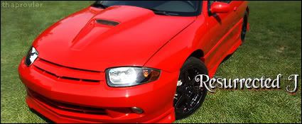
here's on Resurrected J
Just messed around its skunks hood and headlights lowerd and slight paint


Theyre not bad for just starting.
I'd say you need to tighten up your selections, and what are you using to change colors?
I havent used PS 6 in a very long time so I don't want to suggest using features i have in CS4 that wouldnt be in 6.

i use the regular paint brush some cars its nice but some arn't

andy porambo wrote:i use the regular paint brush some cars its nice but some arn't
Not the best to use, I'd say select the area and use a color adjustment tool if you have it available to you in PS6.

i found a tut. after your comment so i figured it out ill post new ones by about 11

Definitely getting better, now just tighten up your selections and pay attention to the little details that, even if are very subtle, will throw it off.
Also look into adding a shadow under the car when you drop it since the car will cover up the existing shadow.
Keep it up. Very nice job.

not sure is PS6 has it, but when painting on a new layer such as a hood or panel etc, use blending options, such as colour. This is will "paint" your car not just lay colour on top.
not bad man i'm diggin those projectors


yea i only wanted to use the projectors but the evil eye hood cut them off but it was the best angle

new one i tried some new things with paint
was K.I.T.T from the new knight rider


another new one still trying to figure out that ctrl-u paint thing and i'm getting alittle better but here it is its Raven's 3800 turbo


not taking any credit for original design on this car but I did an ok chop of it usual things lower rim color and paint


Nice job youre definitely getting the hang of it now.

for me Ctrl U is for the Saturation/Hue/Brightness... i have CS... not for the color balance... but that could be a difference between the versions.
showing some progress...

Godspeed wrote:for me Ctrl U is for the Saturation/Hue/Brightness... i have CS... not for the color balance... but that could be a difference between the versions.
showing some progress...
Yeah, Command+U is for my Hue/Saturation too and Command+B is for color balance on CS#

then you can tell me if i did good or not with mine
