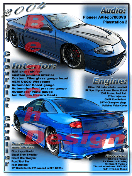
I just finished up on a spec sheet/poster for EcoEnvy's sweet Cavalier. He wanted to be able to display all the mod's he's done next to his ride at upcoming carshows.
_________________________________________________
Check out my website with my "CarToonZ" @
http://beachdesign1.com
Well, I'll throw my two cents in here, take it or leave it.
It doesn't look bad, don't get me wrong. Just want to give my advice.
Gradient overlays and Bevel/Emboss don't really give the professional look people go for at a car show. So I suggest, make all the text the same size and use solid colors.
^^^^^^^^ Well, first of all, I think it looks amazing!! Second, that has got to be one of the better set ups for a show that I have seen, some people slap stuff on a board and call it done. So, to say it doesn't look professional enough for a car show, I say that's dead wrong!!

CrazedCav wrote:Well, I'll throw my two cents in here, take it or leave it.
It doesn't look bad, don't get me wrong. Just want to give my advice.
Gradient overlays and Bevel/Emboss don't really give the professional look people go for at a car show. So I suggest, make all the text the same size and use solid colors.
This kid knows what he's talking about...He is exactly right about Bevel Emboss and Gradients. Those are things that should rarely be used. Try simple strokes, or subtle drop shadows. Really just Solid colors. Work with shapes instead of effects. You will achieve a much nicer layout.

BTW, the tooning aspect of the peice looks great, as always.
LOOKS AWESOME AS ALWAYS BEACH!!!
but i must agree... the different size fonts are kind of distractive.
I appreciate the constructive criticism guys. Ive only done a couple of car posters/spec sheets. My specialty is the Tooning

. When I get some time, in the next couple of days, Im going to take the suggestions that were listed and re-do the poster.
The type was different sizes because there was so much that he wanted to list and I was running out of room. The size of the poster is 18x24. Any suggestions on a different size for the poster so I can get everything in?
Now when suggesting Simple strokes and subtle drop shadows, were you referring to the words or the toons?
If any one else has any comments, keep them coming. Its good to hear the feedback.
Oh, and not to worry, Ill lay off the gradient overlays and the Bevel/Embossing from now on

_________________________________________________
Check out my website with my "CarToonZ" @
http://beachdesign1.com
I know I've said it before, but I still look at Beach's work and half the time I wonder "what toon?". To me, the cars simply look better than reality -- as though that are in their shiniest possible state with ideal high-contrast lighting. Is it a toon? I don't think so. Does it kick ass? You better believe it.
I share some of the sentiments on the poster design. Try for more clean edges, and fewer blurred gradient boxes. Pick a font size to use for the headings and text for all sections, and stick with it, even if it means smaller text that doesn't fill every blank space. If you do stick with some of the background gradients, I'd be tempted to use white behind the text for contrast, and use the gradient in unused space.

Shop Manuals, Brochures:
www.kenmcgeeautobooks.com
I was refering to text. A good designer can take constructive critisism and improve his work, which is what you have done.
as always a toon done to perfection.. i know nothing bout the show aspect and lettering but with a professionally tooned poster like that who really cares?


 ]Support the ORG, go Premium...