CodeRedZ24 will be pleased, since I threadjacked
his first major toon thread earlier. I'm relocated here to avoid a serious incident.

I'm not sure what the recent fascination is with illustrated-look "toons" of our cars lately, but I admit I was sucked in. I wanted to have a simple and elegant rendering of my own car, but didn't want to trouble anybody else with the task since I could see it took some serious effort. It wasn't as trivial as a Photoshop paint color change or wheel swap. So -- I decided to have a go of it on my own. Thanks to
Evan, whose
tooning skills have been displayed on the forum a lot lately. His rendering of lafngas' car was the one that convinced me that I should learn to do this.
I followed the downloadable instructions in the
how to toon thread. I had some Photoshop experience, but have as a rule avoided anything vector-based. I found the pen tool intimidating, since it wasn't as straightforward as simply taking the cursor where you wanted to go. I spent the first several hours trying to make it listen to me. I also spend about an hour trying to figure out why the "stroke path" option was never available. After a quick adjustment to the pen tool options, I was on my way.
Original picture:

Lineart - minus wheel detail and headlights:

Body basic color - still neglecting headlights:

Additional highlight detail - all the hard parts are still missing:


I may not get as much work done now that the weekend is over, but I'll continue to post any progress in this thread, now that I've gone to the trouble of starting it.


Shop Manuals, Brochures:
www.kenmcgeeautobooks.com
The headlights will get a second look after I get some sleep. As it was, they weren't translating into outlines just as easily as I would have liked.

Edited 1 time(s). Last edited Monday, April 16, 2007 6:57 PM

Shop Manuals, Brochures:
www.kenmcgeeautobooks.com
Very nice, Josh.
 DISCLAIMER
I'm a bitch. Look out. I'm here to start drama.
Please take everything I say seriously.
Quote:
I also spend about an hour trying to figure out why the "stroke path" option was never available

been there. every now and then for what ever reason i have to go back and figure it out again, and the first time it took me a really long time to fix. i think photoshop just likes messing with me sometimes.
the toon's looking good. and headlights are a major pain. i'm finally doing one of the back of a car and its so much easier doing tails


Thanks guys. I know for a fact that a lot of my troubles so far have been from trying to make it too realistic. It's kind of sad that my favorite part at the moment is how the interior came out. Maybe because it's deceptively simple.


Shop Manuals, Brochures:
www.kenmcgeeautobooks.com
Still need to detail the wheels. Finally enough color that it's more economical to save as a JPEG than a GIF.


Shop Manuals, Brochures:
www.kenmcgeeautobooks.com
jpeg and png own all. gif sucks. The car's lookin really good. How many hours has it been now? You should be getting pretty good with the pen tool. You said at first it wasn't very straightforward, but you seem have done pretty well with it.

Evan Bare wrote:jpeg and png own all. gif sucks. The car's lookin really good. How many hours has it been now? You should be getting pretty good with the pen tool. You said at first it wasn't very straightforward, but you seem have done pretty well with it.
GIF is just fine for lineart and non-photographic illustration such as logos or the early stages of my toon. JPEG tends to mangle sharp edges with compression unless you compromise and make huge files, and PNG doesn't enjoy completely universal adoption yet.

Probably going on 20-22 hours now. I've sort of lost count. I find the pen tool easy enough to use now, but I'm still a bit mystified by Photoshop's implementation. Paths and shapes and strokes and selections -- I still feel like I have to "trick" it into doing what I want. I'm probably just not seeing the big picture of how everything ties together, which is entirely possible since I'm completely self taught. In all likelyhood half the stuff I do is making more work for myself.


Shop Manuals, Brochures:
www.kenmcgeeautobooks.com
yeah i know what you mean. i taught it to myself as well. i'd hate for someone who knows what they're doing watch me work. if you have some time check out
these tutorials, they have some good things to look at there, i wish i had found it earlier. and i know what you mean about gif, i usually just compress my jpegs as big as they can get, but i guess i have no mercy for those poor people on dial up

. still hoping for the day png is everywhere. i couldnt skin anything w/out it.

Well, I'm done! (At least until I notice something else that bugs me).

Color, also available in
Full size 1200x1600 original (great for wallpapers)

Black and white version, just because I liked it.


Thanks to everyone for their advice and comments during this extended exercise in tedium. Further comments welcome, though I would advise you not to piss me off, since this bloody thing took so Ef-ing long to do.


Shop Manuals, Brochures:
www.kenmcgeeautobooks.com
looks great, hope you feel the effort was worth it. now make it into your freakin sig already!! if you get the hankering, feel free to jack my
thread and do some of the people asking for toons over there

(except the ones offering money, i call dibs)
and it looks like you're going for the sporty no-wiper look in your toon

i guess if you drive fast enough the bug deflector keeps everything off

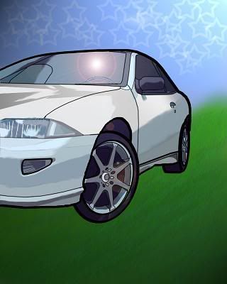
this is my first attempt ever took me about 6-7 hours i need to learn how to do headlights and other minor details but anyway here it is

hope your not made i posted it in here geeky i didn;t wanna create a new thread and p.s. your toon looks awesome i love it

MTXCavalier wrote:hope your not made i posted it in here geeky i didn;t wanna create a new thread and p.s. your toon looks awesome i love it
No prob. Nice work. Nice wheels.

Your headlights probably would look fine if the vertical lines were more consistent. I made one line with the pen tool on mine, and copied it over and over so they would match. A shadow would help plant the car against the background. Also, please avoid using the lens flare filter -- if there's one thing I learned while rooming with a graphic design student in college, it's that an exposed lense flare is like a big target that says "look at me, I'm learning how to use photoshop". No offense.

Edited 1 time(s). Last edited Thursday, April 19, 2007 12:16 PM

Shop Manuals, Brochures:
www.kenmcgeeautobooks.com
hahah thx for the hits i am going to work on the headlights and take the lens flare out ...p.s. the rims are nice i dunno why everyone hates them so much i love the look of them


i guess if you drive fast enough the bug deflector keeps everything off


