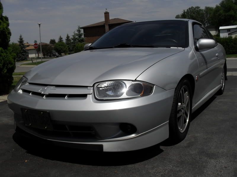
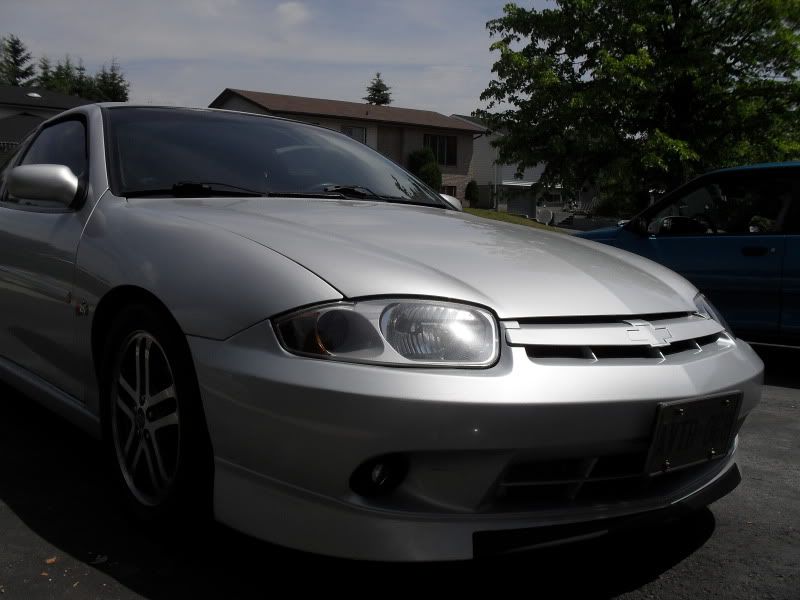
I'm on the fence about this one guys. Need some input.....


So...silver painted bezels with night shaded turns and marker.
What do you think?!?!?!

M62, 42's, ZZP 3", ZZP S3 H/E
214whp 190wtq
i like it... maybe do a retrofit to projectors and paint the whole inside silver instead of leaving the reflective part?
either way my vote is do itttt

I don't really think it quite works with silver...
It would be hot with arrival blue or burnt orange though.

Paying someone to install parts and bragging about it being fast, is like watching someone bang your wife and being proud to raise their kids.
Smoosh wrote:i like it... maybe do a retrofit to projectors and paint the whole inside silver instead of leaving the reflective part?
either way my vote is do itttt
Getting away from the projectors now. Going back to bulbs. Too much draw from my projectors and HID fogs for my wiring.

M62, 42's, ZZP 3", ZZP S3 H/E
214whp 190wtq
I kind of like it, but I think I would have liked it more without the night shaded reflectors. Looks like a dark muddy brownish orange, unless it's just those pics... I think stock orange would have looked way better.

slvrblit wrote:Smoosh wrote:i like it... maybe do a retrofit to projectors and paint the whole inside silver instead of leaving the reflective part?
either way my vote is do itttt
Getting away from the projectors now. Going back to bulbs. Too much draw from my projectors and HID fogs for my wiring.
They do make a harness for that!

Joe Schulte wrote:slvrblit wrote:Smoosh wrote:i like it... maybe do a retrofit to projectors and paint the whole inside silver instead of leaving the reflective part?
either way my vote is do itttt
Getting away from the projectors now. Going back to bulbs. Too much draw from my projectors and HID fogs for my wiring.
They do make a harness for that!
This ^^^^^^
I've had 3 sets of 55watt HID's going without a problem so this is no excuse. Get a harness and solve the problem.
Also I think it would look better without the nightshade.
I <3 JGM
I think bigfoot is blurry,
that's the problem. It's not the photographer's fault. Bigfoot is blurry. And that's extra
scary to me. There's a large, out-of-focus monster, roaming the countryside.
"Run! He's fuzzy!" "Get outta here!"

In Loving Memory of Phil Martin December 14 2005
there is no contrast, it doesnt look right.

lafonjef wrote:Quiklilcav wrote:I like it, but it would be better with clear reflectors.
This^^
Word....still looks good though...

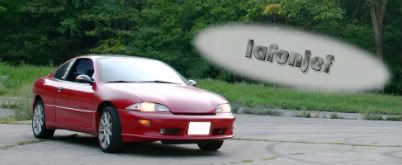
I like the way you're lights look on you're sig pic better.
C:\Users\Phillip\Pictures

