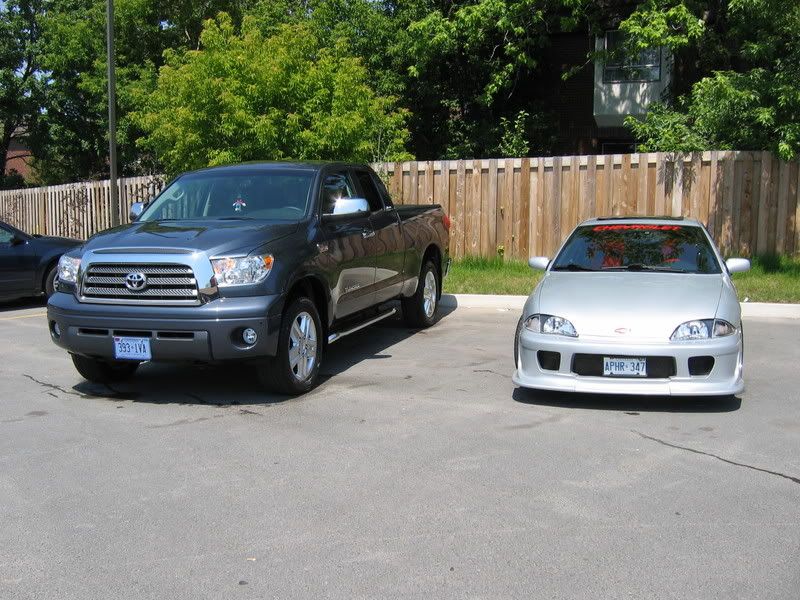
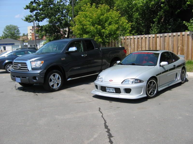
Bigger and uglier, i like the old design..
On a better note, I loooove your car..its beautiful

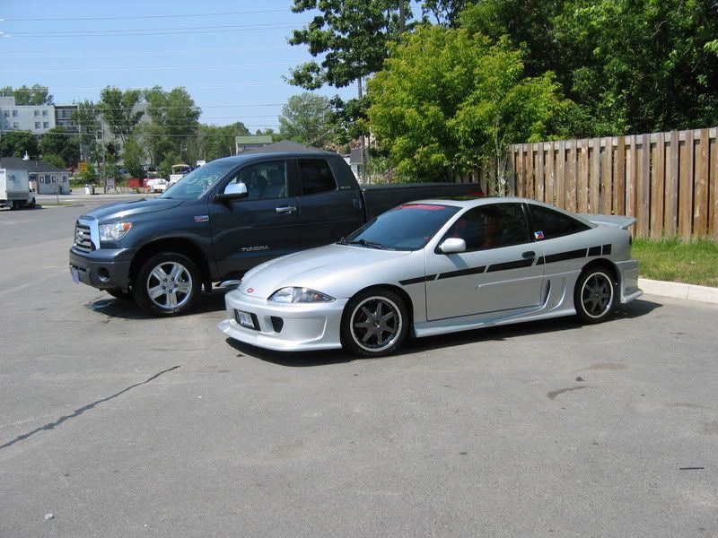
love the car... but the graphics have got to go. the ends dont line up with any of the body lines.

^ Agreed.
Despite being huge the new Tundra is an awesome truck from what I'm gathering.
For sure towers over that cute little Cav.

Dude, when the heck did you put the graphics on the car lol.

M62, 42's, ZZP 3", ZZP S3 H/E
214whp 190wtq
I love the graphics, but they need to be longer and a little higer so they blend in with the door handles

I like the cav. a little iffy on the graphic on it, like a few have mentioned. But the new tundras look fat . with the new bigger body, rounded pannels, combined with the small head and tail lights and seemingly small windows, it just looks fat.
On the other hand....you have other fingers.

KevinP (Stabby McShankyou) wrote:not funny... i just can't find that funny... not with 2 copies of the Candyland board game on your shelf.
Yeah, it's not perfect but the graphic is temporary until I get paint next year. It's actually positioned to cover paint damage that happened during the body kit install. While removing the old moulding, one section had been epoxied and pulled paint. Until then, I gotta ride "Fast and Furious" ... lol

Cav looks good. I'd lose the hood emblem.
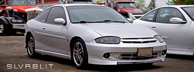
I like how your cav is in your sig... Very clean.....
~2014 New Z under the knife, same heart different body~
______________________
WHITECAVY no more
2012 numbers - 4SPD AUTOMATIC!!
328 HP
306 TQ

